

Private Label ADA Sign Material Supplier Partnerships That Balance Branding and Accessibility
2026-11-16
Finding ADA sign materials that don't flatten a brand into a generic afterthought is harder than it should be. Compliance often wins, and identity gets lost in beige plastic and default typography. That tension is exactly where private label partnerships should step in. LYSHIRE supplies ADA sign materials to fabricators and distributors who need to meet code without dulling the brand experience. In this post, we'll break down what a balanced partnership looks like, from material selection to the details that keep accessibility and branding on the same side.
Where Tactile Code Meets Brand Surface
Most brand surfaces stop at the visual. Texture, when it shows up at all, is a decorative afterthought. This project starts from a different assumption: that a raised dot, a ridge, a change in grain can carry meaning as precise as any line of type. The surface becomes a quiet interface, readable by fingertips before the eyes take over.
The challenge is not simply adding tactile elements to packaging or signage. It is making those elements feel native to the brand rather than bolted on for compliance. That means weighing the spacing and height of the code against the materials, the finish, the way light falls across the surface. A dot pattern might echo the weave of a textile or the perforation of a speaker grille, so the functional layer and the brand expression become one gesture.
The result is a surface that rewards touch as much as sight. It carries information for those who need it, while offering everyone a more physical reason to pause and pay attention. The brand does not announce its inclusiveness; it simply feels more considered in the hand.
Material Partners Who Read the Room Before the Spec Sheet
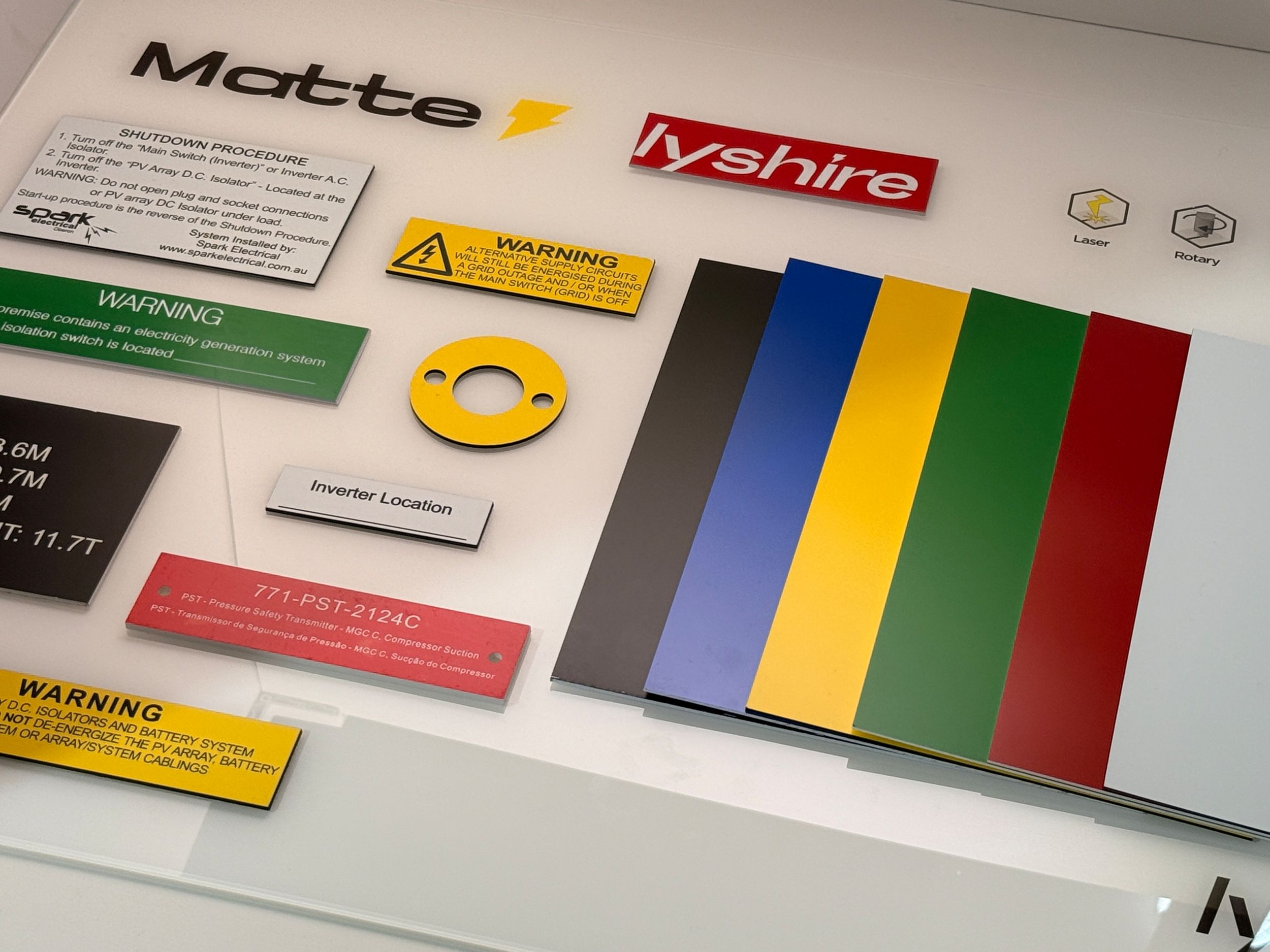
The most useful material partners don't lead with part numbers or lead times. They walk into a space and notice how light moves across a wall, how sound bounces off a bare ceiling, or how many hands will touch a surface before noon. Those observations shape their first questions, and the spec sheet shows up later, almost as a formality.
A supplier who reads the room might steer a designer toward a matte laminate near a bank of south-facing windows because the glare would be unbearable otherwise. Another might suggest a fabric with a tighter weave for a clinic waiting area, knowing that quiet and easy cleaning matter more than a bold pattern. None of that logic lives in a datasheet, but it lives in the room.
When material partners bring that kind of attention early, decisions start to feel less like guesswork. The final palette often looks inevitable, even though it grew out of small, site-specific observations rather than a generic checklist.
Accessible Signage That Keeps Your Visual Voice
Accessible signage rarely fails because of a lack of good intentions. It fails when the rules get bolted on at the end, forcing a brand to trade its visual voice for a set of generic fixes. Better outcomes come from treating tactile letters, braille panels and non-glare finishes as materials to compose with, not boxes to tick. A color palette can stay distinctive while meeting contrast needs; a custom typeface can hold its character with adjusted stroke weights and spacing. The sign still sounds like the place it belongs to.
The difference shows in small moves. Braille that follows the rhythm of the layout instead of sitting in a separate strip. Pictograms drawn with the same line weight as the rest of the identity. Matte surfaces that preserve depth and shadow without throwing reflections at people with low vision. When these choices are made early, the result feels less like an accessibility retrofit and more like a natural extension of the visual system. People who rely on those cues get a clearer reading of the space, and everyone else simply sees a sign that looks intentional.
Specifying Contrast Without Flattening Your Palette
High contrast requirements often push teams toward muting an entire palette, which leaves a product feeling washed-out and visually monotonous. The problem is not the range of hues but the way color pairs are assigned. Instead of darkening every swatch, keep the mid-tone and bright variants intact for large surfaces, icons, and decorative accents, then select separate text-safe values that carry the heavier contrast load.
Treat contrast as a relationship between two surfaces rather than a single property of a color. A vivid orange can fail as text on white but work perfectly as a button background with near-black labels, or as a focus ring against a dark header. Building a small set of foreground and background partners for each family makes it possible to hold onto saturated brand colors without forcing them into roles they were never meant to play.
In practice, this means naming color roles by their job rather than by their position in a ramp. Use tokens like text-on-accent, border-strong, and surface-muted, and assign the accessible value at the token level. That way, the core palette stays lively while the system can still specify exactly which combination appears in small text, large text, icons, and UI states. The result is a palette that still has depth, with contrast handled where it actually matters.
Private Label Supply Chains That Protect Design Intent
In private label, the gap between a designer's original concept and what arrives on shelf usually comes down to the supply chain's tolerance for substitution. Protecting design intent means treating material weight, stitching density, hardware finish, and even the angle of a collar as locked specifications, not suggestions. Once a factory learns that a slightly cheaper lining or a narrower hem won't trigger rejection, the product quietly drifts away from the sample.
The most effective chains build checkpoints around the details that carry the design. A trim card with approved swatches and a sealed reference sample travel with every production order, and any deviation requires written sign-off before cutting begins. This is less about adding bureaucracy and more about giving factories a clear, physical standard to match. When the standard is vague, factories default to what is fastest or cheapest, and that is where the design erodes.
Long-term supplier relationships also matter here. A factory that understands the brand's tolerance for variation will flag issues early instead of making quiet adjustments. Regular inline inspections at the first production run catch drift before it becomes inventory. Protecting design intent doesn't demand perfection; it demands consistency between what was approved and what gets produced, lot after lot.
The Subtle Art of Code-Ready, Brand-First Sign Materials
Most sign projects fall apart in the gap between what a brand wants and what a building inspector will actually approve. Code-ready, brand-first sign materials close that gap without turning every sign into a bland compromise. The trick is choosing substrates and finishes that satisfy fire ratings, mounting constraints, or accessibility rules while still holding the exact color depth, typography, and texture the brand relies on.
That often means moving past the default acrylic or vinyl and asking earlier whether a matte laminate will shift the approved palette under hallway lighting, or whether a thinner aluminum face can handle the wind load without visible fasteners. It is less about finding a magic material and more about sequencing decisions so compliance is baked into the visual system, not bolted on after the design is finished.
The result is signage that feels intentional from the first mockup to the final install. Brand teams stay confident because the identity remains intact, and fabricators avoid the usual back-and-forth of re-engineering materials after permits come back. When code requirements are treated as design inputs instead of obstacles, the materials do quieter, better work.
FAQ
Look for suppliers who understand both federal accessibility requirements and your brand's visual identity—not just someone who ships blanks. They should help you choose tactile materials that hold up under heavy use while preserving accurate colors and finishes.
It often comes down to material selection and finish. A capable partner can use layered acrylics, brushed metals, or matte laminates to meet contrast ratios without forcing you to abandon core brand colors entirely. They may adjust tone rather than hue.
Yes, if the supplier uses proper photopolymer, laminated acrylic, or UV-stable substrates. The partnership matters because they can recommend thickness and edge treatments that survive hallway carts, cleaning chemicals, and direct sunlight.
A real partnership involves shared templates, material libraries, and ordering protocols. Instead of forcing your brand into stock options, the supplier adapts fabrication to your standards while keeping compliance consistent across locations.
Many brands prefer matte acrylic with tactile copy and a clear or colored second layer. Brushed aluminum or wood-look laminates can also work if the supplier verifies non-glare and contrast performance before production.
They should offer a controlled material palette and a documented sign standard. When every property orders through the same private label program, color, typography, and tactile quality stay uniform without rechecking compliance each time.
Ask about minimum order quantities, lead times for custom materials, how they handle color matching, and whether they provide physical samples for accessibility review. Also confirm who owns the tooling or templates if you need to switch suppliers later.
Absolutely. Thoughtful material pairings, rounded corners, and subtle texture can make signs feel part of the interior design. A skilled supplier balances code-driven clarity with softer visual details so accessibility doesn't look like an afterthought.
Conclusion
Private label ADA sign material partnerships succeed when tactile code requirements are met without erasing the visual identity of a space. The most effective suppliers do not start with the spec sheet; they study the environment, the lighting, the wall finishes, and the existing brand cues before recommending photopolymer, acrylic, or metal laminates. That level of attention keeps accessible signage from becoming a generic afterthought. Instead, the raised characters, braille dots, and mounting details become part of the same material story as the logo, the palette, and the wayfinding rhythm. It is possible to hold contrast ratios and dimensional standards while still letting brand colors breathe, choosing a warm off-white against deep green rather than defaulting to black and white. This is where a private label partner protects design intent: the supply chain is built around your finishes, your edge profiles, and your substrates, not a catalog of lookalike products.
The difference often shows in small decisions. A knowledgeable material partner reads the room before quoting a job, noticing how daylight hits a lobby or whether a hallway leans warm or cool. That awareness helps select materials and textures that meet code without flattening the overall aesthetic. They can advise on matte versus gloss, the depth of tactile letterforms, or how a brushed metal faceplate can carry both a brand mark and compliant lettering without visual conflict. Private label relationships also shield designers from substitutions that quietly alter tone or sheen. In the end, the best outcomes feel inevitable: signs that are clearly legible, code-ready, and unmistakably yours, where accessibility standards operate as a quiet framework beneath the surface, not as a disruption to brand voice.
Contact Us
Contact Person: Tina Hou
Email: [email protected]
Tel/WhatsApp: +86 17816238685
Website: https://www.lyshire.com